The technological breakthrough of the new millennium, growing numbers of people who have a smartphone in their pockets, and the ongoing disaster that is the global pandemic… What happened in the recent history of humankind has contributed to the digitalization of nearly everything, ranging from just ordering food for dinner to a whole process of education conducted solely through digital screens. With this amount of services finding themselves a place in the digital world in our daily technological devices, it was unavoidable for shops of any kind to evolve and be a part of this digital transformation.
Online shopping or e-commerce is decisively moving towards becoming the norm in the foreseeable future. Countless fully online shops aside, nearly all traditional brands are already enjoying the benefits of e-commerce platforms and offering a wide range of services to satisfy anyone’s needs without even leaving their couch. And e-commerce applications, as the most popular and profitable ways of reaching online customers, are continuously making their way to the app stores of smartphone owners. For further reading on why m-commerce is the new best way to set up online shops, you can check our article ‘E-Commerce is Old News, Long Live M-Commerce’.
The increasing number and types of e-commerce apps do not necessarily mean that their quality and profitability also grow over time. Designing an e-commerce app that attracts customers and keeps them engaged requires a bit of knowledge of how consumers use e-commerce apps and what makes them return to the application. In this article, we discussed how to design an e-commerce app in the most profitable way possible.
Creating the right app design: why is it important?
Designing an e-commerce app can be a complex process, and many factors need to be considered before you start developing your own app. Since increasing your e-commerce profitability is your number one goal, you need to start thinking about what your app needs to do differently to keep customers’ experiences positive. First things first, when designing an e-commerce app, it’s essential to prioritize the user’s experience with the application. An unsatisfying user experience means 30% of the users will get frustrated and immediately stop using your app.1 So, the more your app provides an engaging experience to your users, the more it will convert downloads into profits. Besides that, delays when using an app also decrease the number of consumers interested in buying your products or services. Roughly, every 0.1-second delay in an application causes a 1% decrease in sales.1 This means that one of your main goals when designing an app is to create a seamless and intuitive experience for the customer. You should make an app that is attractive and engaging but also easy to use and functional.
When thinking about the design of an app, one may instantly dive into the way the user interface looks, the shapes and colors used in the design, or the overall fanciness of the design. But one of the core things you need to consider while designing your app is that eye candy should not be your primary focus.
Tips to Design a Profitable E-Commerce App
Be as clear as possible
Think about this; you are a consumer trying to find a particular product on your e-commerce app. Regardless if it’s your first time using the app or if you are a regular user, your goal is simple, and it is just finding the right product in the least amount of time possible. In your application design, you need to focus on clarity while navigating through your app’s endless amount of pages.
Avoid complex designs with overly bright colours. Always let your users know what page they are on. Make your menu and return buttons easy to see and your in-app texts easy to read. Choose relatively simple font styles. Make it seamless for your users to find out how they will add an item to their cart, how they can check out, how you will display further details for an item, and how they can use the filter & search function of your app. Long story short, be precise with the design of your user interface.
Right positioning is the key
Some parts of your user interface are more important than other areas on the screen, such as the ‘Add to cart’ button, the search bar, the checkout button on the cart screen, or the pay button on your payment options screen. Since these are important in converting your app uses into purchases, focusing on the placement of these elements will directly affect your in-app purchases. And what needs to be considered while designing an app is that these buttons need to be easily reachable by anyone holding their phone in their hands.
So, check if your critical elements in the UI fall in the ‘Thumb zone’, which refers to the easily reachable parts of a smartphone screen using the user’s thumb.
Establish a well-thought hierarchy of elements
When a user starts checking out a page in your app, it’s impossible to expect them to read every single thing on display. Instead, users quickly skim through pages and try to find relevant information with what they are searching for. And surprisingly, as research made by Nielsen Norman Group supports2, people use similar patterns while scanning through a page with their eyes. Below, you can see two of the most common patterns users use while ‘reading’ a page; Z-pattern and Zig-Zag pattern. Using these patterns while positioning essential information about your brand and products can improve your ability to attract customers by streamlining your user’s experience. Also, placing CTA’s in the middle and top parts of your pages helps your users discover what they are looking for in your app.
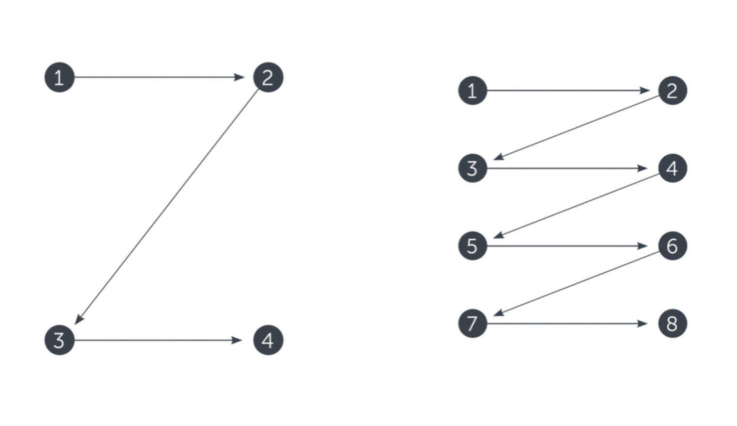
Source: TubikStudio
Provide overall ease
As we stated many times before in our article, it’s crucially important for you to offer a seamless experience for your customers. Focus on ways you can improve your users’ experience so they can enjoy your application without any inconvenience. For example; let them easily sign in to your app using their social media accounts, avoid having long check-out and sign-in processes, display related products that are frequently bought together, add the function to zoom in on product images, or let them make their intended purchases with as few touches as possible. Making minor changes like that in your app design might not look like changing a lot, but they all contribute to the overall practicality of your app and eventually help you increase your profits.
You don’t have any experience in app design? Not a problem.
You read the basics of creating a profitable e-commerce app; now it’s time to put what you have learned to the test. And lucky for you, you don’t necessarily have to learn how to code at all to create your own e-commerce app.
Mowico no-code app builder helps you transform your e-commerce platform into a mobile application in just several hours without necessitating any kind of coding knowledge. By using Mowico, you can transfer all the content of your e-commerce business into a mobile app without any sort of compatibility issues since you can use Mowico with more than 35 different e-commerce platforms. After transferring your e-commerce content, it’s a straightforward process to manage your application and change the design of your app as you wish with just a simple drag and drop process. Start trying Mowico now for free, and carry your e-commerce business one step forward!
