


Are you tired of apps with confusing and cluttered navigation? Have you ever found yourself lost in a sea of menus and options, unable to find what you’re looking for?
As mobile app usage continues to soar, developers are under increasing pressure to create apps that are both user-friendly and easy to navigate. One solution that has become increasingly popular in recent years is bottom navigation.
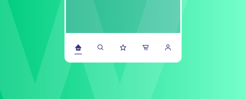
So, what exactly is bottom navigation, and why should you use it in your app design? In short, a bottom navigation bar is a design element that displays three to five primary destinations at the bottom of the screen. Each destination is represented by an icon and may be accompanied by a text label. When users taps on one of these icons, they are taken to the top-level navigation destination associated with that icon.
Not only does bottom navigation provide a cleaner and more streamlined user experience, but it also makes it easier for users to find what they’re looking for. By placing the primary navigation options at the bottom of the screen, users can easily access them with their thumbs, making it more comfortable and natural to use. Additionally, bottom navigation can reduce the cognitive load on users by eliminating the need to remember where certain options are located.
In this post, we’ll go into more detail about the advantages of utilising a bottom navigation bar and offer advice and best practices for creating one that improves your app’s overall user experience. Whether you’re an experienced developer or just getting started, keep reading to see how bottom navigation may elevate the look and feel of your app.
Why Bottom Navigation Bar is Essential for your Mobile App
Using bottom navigation in mobile apps can improve the user experience by providing easy and direct access to the most important features of an app. By following best practices and comparing different types of mobile navigation, developers can create apps that are both functional and user-friendly.
Improved Usability
Bottom navigation enhances the user experience by making it easy for users to switch between top-level views with a single tap. This feature eliminates the need for users to navigate through several screens to access important features of an app, improving usability and satisfaction. Also, bottom navigation makes it simpler to carry out tasks like making a purchase or looking for specific information by always keeping these options close at hand.
Space Efficient
Bottom navigation is space-efficient because it is displayed at the bottom of the screen, saving space for other important information on the app’s interface. In comparison to other types of navigation, such as tabs or drawers, bottom navigation allows for more content to be displayed on the screen. This is particularly important for mobile devices with smaller screens where every inch of space is valuable.
By placing the navigation options at the bottom, it frees up space for displaying more information on the app’s interface, such as product images, descriptions, and prices. This can enhance the overall user experience and make the app more engaging.
Reduced Cognitive Load
By showing only the most important destinations, bottom navigation reduces cognitive load and improves the user’s ability to complete tasks efficiently. Bottom navigation provides a clear and concise set of options, reducing the cognitive load on the user. By limiting the number of options and only displaying the most important destinations, it simplifies the decision-making process for users and helps them focus on the task at hand.
This also makes the app easier to use, particularly for first-time users who may be overwhelmed by a cluttered interface. Furthermore, by displaying only the top-level destinations, it avoids overwhelming users with too many submenus or options, resulting in a faster and more efficient navigation experience.
Best Practices for Using Bottom Navigation
Number of Destinations
On the bottom navigation, aim for three to five top-level destinations. Too many destinations can clutter the interface and overwhelm users, while too few can limit the app’s functionality. When choosing which destinations to include, it’s also crucial to give the priority of the most often used one while also taking the user’s context and demands into account. Regularly evaluating the usage of each destination and making adjustments as needed can also improve the effectiveness of bottom navigation in the long run.
Direct Access
Bottom navigation should be used for top-level destinations of similar importance that require direct access from anywhere in the app. This direct access allows users to quickly access important features without having to navigate through several screens. It is also important to ensure that the labels and icons used in the bottom navigation are clear and easily recognizable to the user, helping to further enhance the usability of the app.
Comparison with Other Types of Mobile Navigation
Tabs
Tabs are similar to bottom navigation, but they are usually located at the top of the screen. Tabs work well for a small number of destinations, but they can take up valuable screen space.
Gestures
Gestures use finger movements to navigate through the app, such as swiping or pinching. Gestures can be intuitive and fun to use, but they require a learning curve and may not be suitable for all users.
Drawers
Drawers are menus that are hidden until users swipe or tap them to reveal the contents. Drawers are useful for presenting a large number of options but can be cumbersome to use and navigate.
Easy Mobile App Development for your E-Commerce Store is Here
If you own an e-commerce store, then you know how crucial it is to have a mobile app that provides a seamless and user-friendly experience to your customers. But developing a mobile app from scratch can be a daunting task, especially if you don’t have coding skills or the resources to hire a professional developer. That’s where no-code e-commerce app development platforms like Mowico come in.
With Mowico, you can create your own custom mobile app for your e-commerce store in just a few clicks, without the need for coding. Not only does this save you time and money, but it also enables you to focus on the most important aspects of your business.
Mowico - Navigation Type

In the “Design” step, you can select which type of navigation your mobile app will have.
You can choose your navigation type as a left menu or tab bar. You may easily change the navigation type whenever you wish. Mowico’s demo navigation bar logo is already uploaded, and you may change the image with your visuals whenever you wish.
One of the standout features of Mowico is its ease of use when it comes to implementing bottom navigation, which allows users to effortlessly navigate through your app, making it more accessible and enjoyable to use. The enhanced user experience leads to increased engagement, customer retention, and higher conversion rates.
By using Mowico, you can create an app with customisable layouts, product catalogues, push notifications, and in-app purchases, your app can become a powerful tool for boosting conversions and retaining customers.
You can find more information about Mowico on our website, where you can also book a demo to start your 14-days free trial.


