Must-Knows of Mobile UX Design
Creating a UX design for mobile is one thing, but in this fast-growing environment, providing a convenient user experience in mobile is the number one priority.
The rise of mobile apps has solidified the superiority of mobile devices. In fact, as of 2022, mobile platforms have taken the lead over desktop devices in terms of market share, and user experience design for apps is more important than it’s ever been.
We are going to discuss one of the hottest topics in e-commerce trends–the must-knows of mobile UX design. We’ll run you through the steps that make a UX design great. But first, let’s start with the basics.
What is Mobile UX?
User experience, or UX for short, is how users feel when interacting with a system. The criteria usually contain the ease of use, efficiency of the system, accessibility of the platform, and utility of the app.
In this sense, mobile UX can be described as users’ overall emotional response to their interactions on a mobile platform.
The mobile device can be of any kind, such as mobile phones or tablets, and user experience can be about apps, websites, software, or the hardware itself. In other words, mobile UX is what defines the relationship between you and your users on your mobile platform.
Why is UX Design for Mobile Essential?
The best way to see if your app is doing well is by tracking your users. Analysing bounce rate, conversion rate, and feedback from your users will tell you how good of a user experience you’re providing.
A bad experience with your app will probably cost you a user for good. In fact, 88% of mobile app users have reported that they are not likely to use the same app after a bad experience.
But losing a user is not the only risk of having an unsatisfactory UX design . Around 62% of consumers reported that they will tell others about a bad experience. In other words, as well as losing a user, you probably won’t be acquiring new ones.
So, in its simplest sense, UX design is essential for mobile app development because it’s the key element that boosts your e-commerce business.
What are the Standards of Mobile UX Design?
Creating a seamless UX design should be your main focus to maintain your users. Mobile app users are fast-moving consumers and any brand is easily switchable for them as long as there’s a more convenient option.
Here are some standards to ensure in your UX design for mobile devices:
Minimising User Effort
Overloading your mobile platform with too much information and tasks can kill the utility of your UX design in an instant. Remember that the entire purpose of creating a good UX design is taking as much weight as you can from users’ shoulders.
Get rid of unnecessary information, visuals, and buttons on your mobile screen. Mobile phones have only so much space available and throwing everything but the kitchen sink there will definitely not be good for your brand.
Pay attention to creating a simplistic user interface. Minimise the need for user input and prevent confusion by simplifying tasks and using familiar pages. Instead of creating a separate design for each step, try to make them utilisable in chunks.
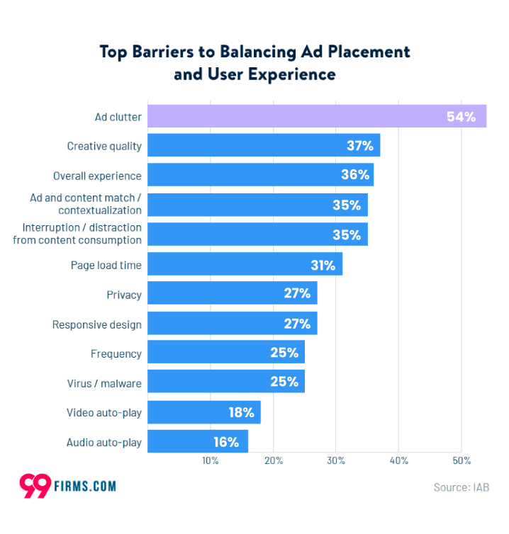
Ads can also hinder your design’s efficiency to a large extent. If you’re planning to incorporate banner ads into your mobile app, be careful with how much and where you put them on display. Ad clutter can repel 54% of your users and it’s one of the biggest barriers to reaching a good UX design.
Engaging the User
Nothing is more painful than opening up a mobile app and not knowing where to touch to get your job done. If your interface is highly unfamiliar and unpredictable for the user, they won’t spend too much time discovering it. They’ll just skip to the next available app.
Keeping your users’ engagement easy is essential for achieving a good UX design. Mobile users wait only 3 seconds for a page to load and it’s naive to expect that they would spend more to engage with your design.
Simple Navigation
You may have so much content to show your users but if they are not easy to find in the app, much of your content can go to waste.
Mobile app users like easy and flowing apps, so you have to make sure that your app is easy to navigate. You can group relevant pages under a single bar and then allow users to navigate through your app in a similar way.
Allowing the First Time Experience
Most apps forget this crucial step but it’s very important that you allow your users to engage with your app for the first time.
Instead of asking for subscription or set-up information right away, leave some room for your users to get used to your app. Allow them to discover what your app is about and how it can benefit them.
Being Responsive
Your users want to know if the visual design of your UX design matches the results they expect from your app.
When they touch a tab on the screen, it’s essential to let users know that their action is being processed. Your design should notify the users that the page is loading or that there’s an error in a detailed manner.
Optimising the Content
It’s worth mentioning that content on a website and content on a mobile app have different characteristics. On the desktop screen, there is a lot of space to showcase your texts, visuals and products.
On the other hand, mobile devices offer you a limited area to provide such content. Therefore, you need to be careful with how you fit your content into the app.
You should use high-quality images proportional to a mobile device screen and organise your texts with consistent fonts to maintain reader-friendly content. Pay attention to preparing short, focused texts with easily readable fonts.
As a side note, do not forget to position your main content in the most accessible part of the screen. Since you’re designing for touch, consider the central areas of the screen to be the most effective. Be sure that your users find what they’re looking for.
These are the must-knows that you need when creating a UX design for your mobile app. It’s essential that you adjust your mobile app features in accordance with these standards so that your app satisfies its mission.
Easy UX Mobile Design is Ready for Your Use
All of this information can seem a little intimidating at first. There are many aspects that you should pay attention to; you must minimise the user effort, engage with them, and optimise your content… It’s already a lot, isn’t it?
But if you have the right tools, it’s actually much easier than it seems to achieve these steps. You can either opt for coding your own app and deal with each design process by yourself or use an eCommerce mobile app builder that takes care of all of these standards, like Mowico.
Mowico is a no-code eCommerce app builder that prioritises user experience. It allows you to create a Magento, BigCommerce, and Shopify mobile app, or whatever eCommerce platform you’re using. By incorporating your web content into a mobile app in a short time, Mowico takes care of providing the optimum UX design for your users.
All you have to do is use our drag-and-drop designer to add or remove components to your mobile app. Mowico is compatible with more than 60 e-commerce platforms, and you can publish your app anytime you’re ready.
So get your Mowico account now and start establishing your mobile app today. With its UX design focus, improve user experience by creating your mobile platform.


