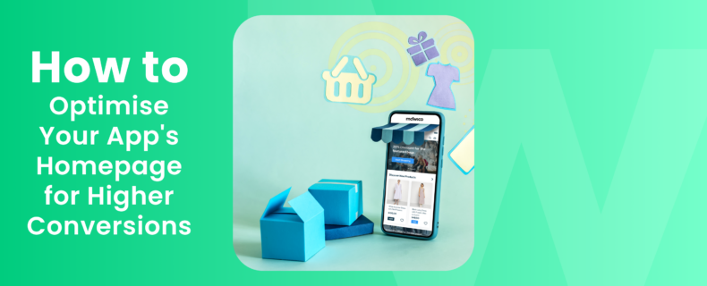
Your eCommerce app’s homepage is the first thing that potential customers see, so it is essential to make sure it is optimised for conversions. 26% of mobile apps are used just once, so you need to please users on the homepage, or your app will fail. A well-optimised homepage can help you increase sales, grow your business, and attract new customers.
In this blog post, we will discuss some of the most important tips for optimising your eCommerce app’s homepage for conversions. We will cover everything from choosing the right headline to using clear calls to action.
Start with a Strong Headline
The headline is the first thing that visitors will see, so it is important to make sure it is attention-grabbing and clear. Your headline should tell visitors what your app is all about and why they should care.
For example, the headline for Amazon‘s homepage is “Amazon.com: Low Prices. Huge Selection. Free Shipping.” This headline is clear, concise, and attention-grabbing. It tells visitors exactly what Amazon is all about and why they should care.
Here are some other examples of strong headlines for app homepages:
- Nike: Just Do It.
- Apple: Think Different.
- Airbnb: Belong Anywhere.
- Netflix: See What’s Next.
- Spotify: Listen to What You Love.
These headlines are all effective because they are clear, concise, and attention-grabbing. They also tell visitors what the app is all about and why they should care.
Use High-Quality Images
Images are a great way to showcase your products and services. They can help visitors visualise what your products look like and how they would be used.
When choosing images for your homepage, make sure they are high-resolution and visually appealing. The images should also be relevant to your products and services.
For example, the homepage for Apple’s iPhone 13 Pro Max features a large, high-resolution image of the phone. The image is clear and well-lit, and it shows off the phone’s features in a visually appealing way.
Here are some other examples of high-quality images that are used on app homepages:
- Amazon: A wide variety of products, from books to electronics to clothing.
- Nike: A variety of athletic shoes and apparel, for both men and women.
- Airbnb: A variety of unique homes and apartments to rent, all over the world.
- Netflix: A wide variety of movies and TV shows, to stream on demand.
- Spotify: A variety of music, from popular hits to obscure indie artists.
These images are all effective because they are high-resolution, visually appealing, and relevant to the products or services being offered.
Highlight Your Best Features
What makes your app unique? What are the benefits that customers will enjoy? Be sure to highlight these features prominently on your homepage.
For example, the homepage for Airbnb highlights the fact that you can “stay in unique homes around the world.” This feature is one of the things that makes Airbnb unique, and it is something that visitors should know about.
Here are some other examples of how app homepages highlight their best features:
- Amazon: Free shipping on orders over $25.
- Nike: Free returns on all orders.
- Airbnb: 24/7 customer support.
- Netflix: A free trial for new users.
- Spotify: A personalised listening experience.
These features are all highlighted in a way that is clear, concise, and attention-grabbing. This helps to persuade visitors to sign up for the app or make a purchase.
Use Clear Calls to Action
Tell visitors what you want them to do, whether it is to browse your products, sign up for your newsletter, or make a purchase. Your calls to action should be clear, concise, and easy to understand.
For example, the homepage for Nike features a clear call to action that says “Shop Now.” This call to action is clear and concise, and it tells visitors exactly what they need to do.
Here are some other examples of clear calls to action that are used on app homepages:
- Amazon: Browse by department.
- Nike: Sign up for our newsletter.
- Airbnb: Book your stay today.
- Netflix: Start your free trial.
- Spotify: Listen now.
These calls to action are all effective because they are clear, concise, and easy to understand. They also tell visitors exactly what they need to do next.
Optimise for Mobile
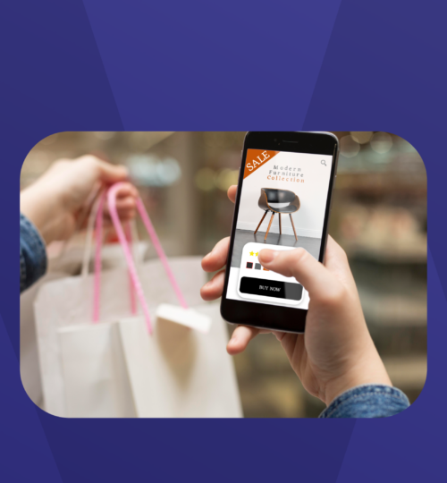
More and more people are using their smartphones to shop online. In fact, 31% of consumers prefer to do their shopping in-app to in-store shopping. With this fact in mind, you need to make sure your homepage is optimised for mobile so that visitors can easily browse and shop on their phones.
There are a few things you can do to optimise your homepage for mobile, such as using a responsive design, making sure your images are optimised for mobile, and using clear and concise text.
Use A/B Testing
A/B testing is a great way to see what works best on your homepage. Try different headlines, images, and calls to action to see what drives the most conversions.
A/B testing is a simple but effective way to improve your homepage. By testing different homepage variations, you can see what works best for your audience and increase your conversions.
Key Takeaways
Your eCommerce app’s homepage is a critical part of your overall marketing strategy. By optimising your homepage for conversions, you can increase sales, grow your business, and attract new customers.
Here are some additional tips that you can consider:
- Use a clear and organised navigation menu. Make it easy for visitors to find the products and information they are looking for.
- Keep your homepage up-to-date. Add new products, promotions, and content regularly to keep visitors coming back.
- Make sure your homepage is secure. Visitors should feel confident that their personal information is safe when they shop on your app.
- Work with an all-in-one mobile app builder.
Mowico is your go-to no-code mobile eCommerce app builder for optimising your eCommerce app’s homepage for higher conversions. With our expertise, we can assist you in creating an attention-grabbing headline, selecting high-quality images, highlighting your unique features, crafting clear calls to action, optimising for mobile, conducting A/B testing, and ultimately driving more conversions.
Sign up for a free trial of Mowico today to see how we can help you improve your eCommerce app’s homepage. We offer a 14-day free trial, so you can try our services without any commitment.


